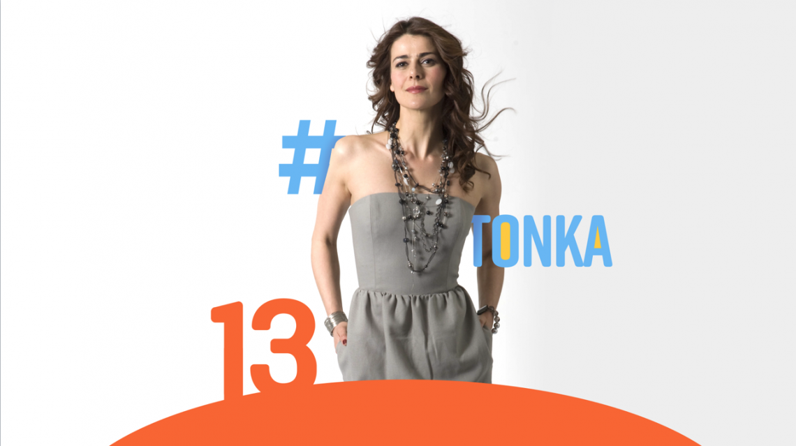
Canal 13’s new look seeks to hold the attention of a society that’s constantly in motion, and symbolizes the channel’s willingness to embrace whatever the future holds through a new horizon set in the logo, inspired by a quote from the film Into The Wild:
“The joy of life comes from our encounters with new experiences, and hence there is no greater joy than to have an endlessly changing horizon, for each day to have a new and different sun”.
The channel wanted to let its audience know it stands by them, sharing experiences from a broader perspective, according to María Tereza Valdivieso, Marketing manager of Canal 13.
“For some time, we had been speaking to the audience only through our programs and we needed to communicate through the brand itself, presenting ourselves as a channel with energy that’s current and connected,” Valdivieso Lecaros says. “We wanted to deliver a very honest message, one that recognizes our history but trends toward the future, demonstrating we are more alive than ever.”
The move takes Canal 13 to the next level, opening it up to the world as it expands to become a more representative and diverse brand.
The look evolved from a corporate image, to a channel that’s more on the forefront. We removed the sphere from the logo, so that it was no longer contained,
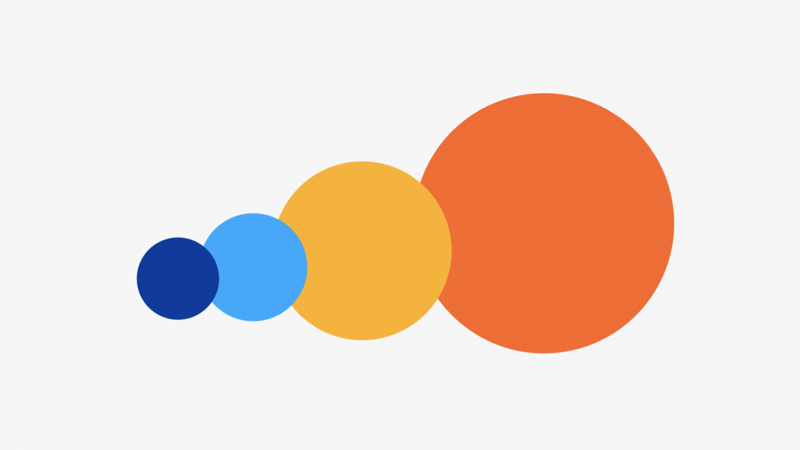
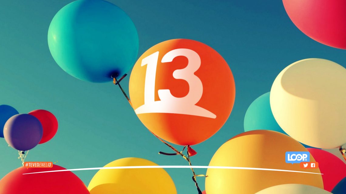
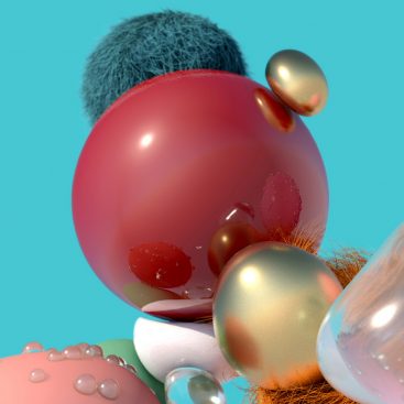
For the palette, Canal 13 retained orange and white—associated with joy, optimism, creativity, emotions and sociability—as its main colors.
In turn, the channel incorporated secondary colors to convey trendiness and freshness.
Yellow offers some of the same feelings as orange, but with a more informal, brighter tone that conjures images of sunshine, and projects warmth, positivity and happiness. This is the color that appears in the morning shows, self-help programs, biographies, sports, outdoor and food programming.
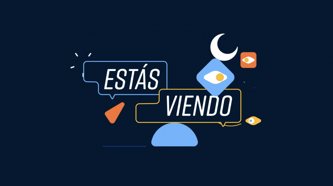
Blue and light blue serve as the brand’s disruptors, offering a sense of diversity. They allude to relaxation, intelligence, fantasy, nighttime, confidence and seriousness, and are used for newscasts, primetime shows, investigation, science fiction and religion programming as well as highlights and temporary changes.
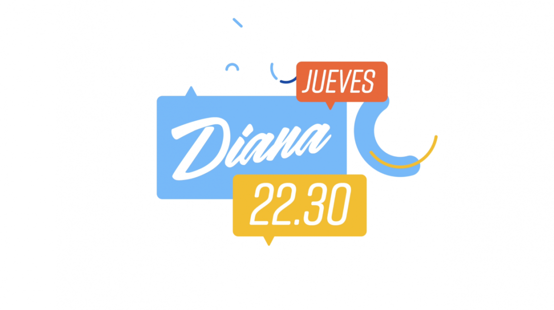
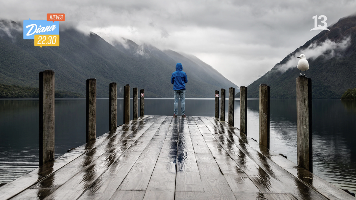
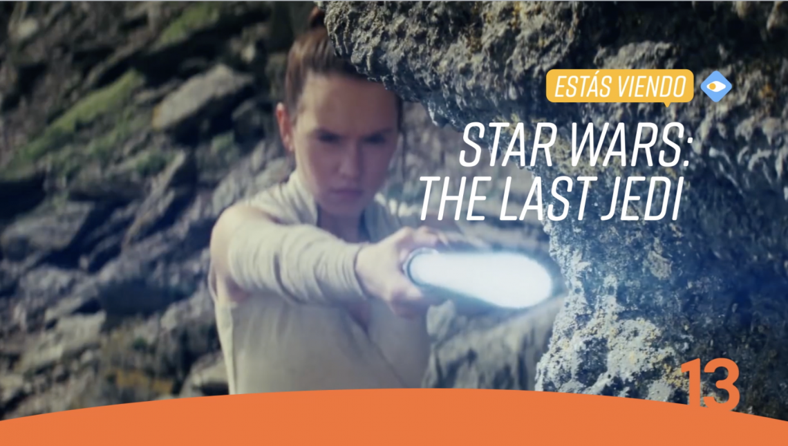
We created a wide universe of colorful graphics to energize the screen: friendly and connected with the new ways of communication as social media, internet and streaming services.
Every on-air graphic is plenty of energy, moving one of the most traditional chilean tv channels into the next media environment.
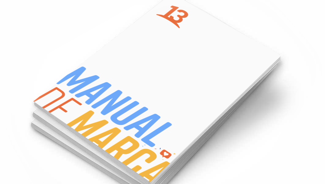
Also was our responsibility put all the concepts together in a brandbook for all kind of applications: corporate, adversiting, social media and on-air. A PDF file with online 24/7 links to download easy editable files for every part of the vendors, agencies, production companies and in-house team of Canal 13.
“We’ve been doing this throughout our history and we will continue doing it. We create content that seeks to be in constant connection to people through new, inspirational, relevant and inclusive experiences,” says Valdivieso Lecaros. “This rebrand features a ‘13’ that’s full of energy, is connected, honors its history, and that is now projecting itself towards the future, where we all fit together.”